What’s in a brand? Well, quite a lot. The Beauhurst brand is more than just a logo and some colours—it’s the heart and soul of our company, from the customer experience through to each and every one of our team members. Today, we’re unveiling our new visual branding. Here’s how it came about.
This isn’t the first time we’ve changed the way our brand looks and feels...
Our co-founders, Toby and Stephen, started the company in 2010 as UKFunders, a solution for finding structured data on investors in the UK. We later moved from investors to investments, before shifting our focus to tracking high-growth companies in 2016.
Since starting out, we’ve changed our name, built the Beauhurst platform as you know it now, and grown the team to over 100 ambitious individuals in London, Nottingham, and elsewhere.
Back in 2017, we created our first proper brand concept and a new logo that riffed on the idea of highlighting the most important information from a mass of data. But as much as we loved these visuals, it was time for a change.
The challenge
In 2019, we carried out a full brand audit, getting to the heart of what makes us unique. Over the last couple of years, we’ve evolved our tone of voice and customer interactions to reflect this. But the problem was, our visual brand still felt out of date.
Don’t get us wrong, we do love yellow—but we needed to add more recognisable brand assets to our toolkit, to prepare for the next stage of our growth.
Most importantly, we needed a brand that had our company vision at its core. We don’t plaster it over everything we do (that’s a bit too corporate for us), but we believe that great data, applied intelligently, benefits society.
The process
To develop a new visual brand, we had to go back to our vision. Data has the power to significantly change society. Indeed, since antiquity, humans have created ways to bring order and sense to large amounts of data, finding connections that weren’t visible before, to improve their lives.
We were inspired by all the different ways that humans have done this: from the abacus through to early mapping systems. But we were particularly interested in the quipu—a system of strings and knots used by the Incans to record and communicate information, including tax records, census data, livestock management and the calendar.
These strings and knots became the basis of our new visual brand.
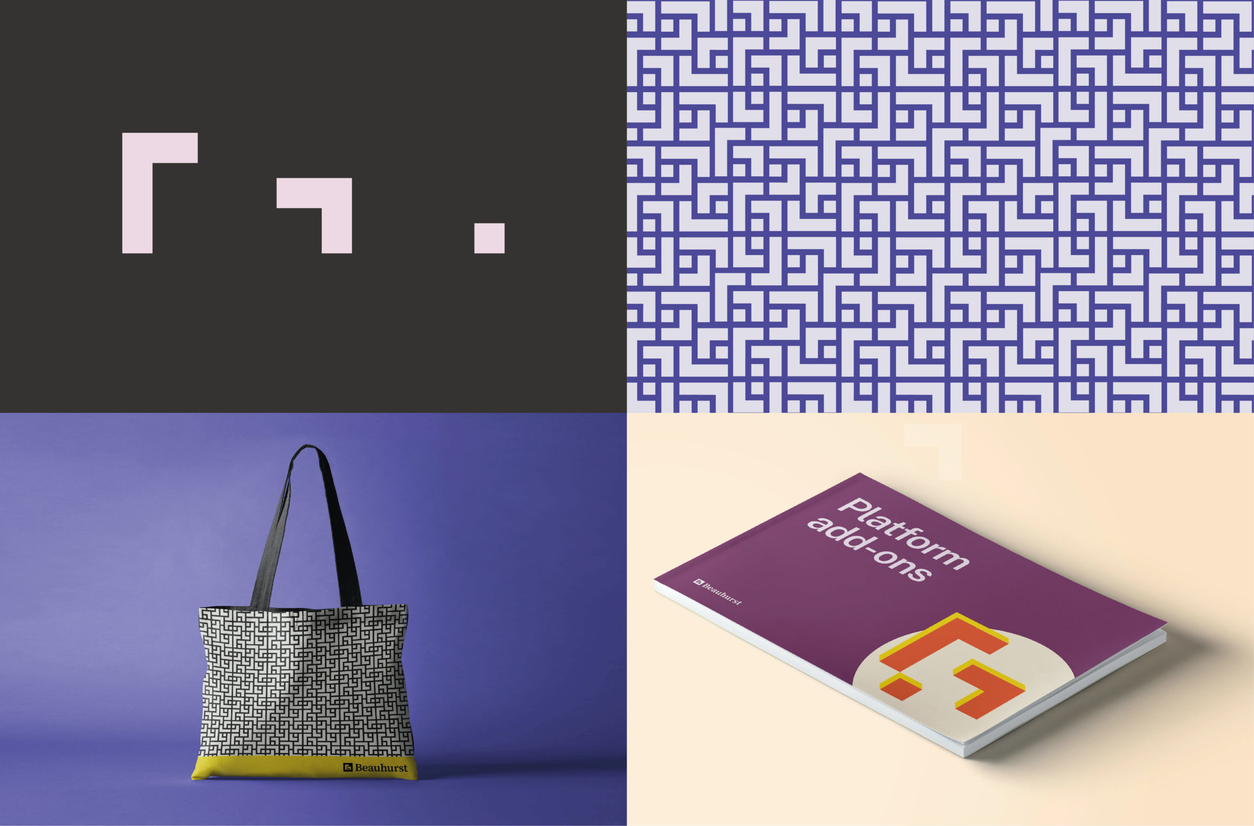
Our new logo
The symbol for Beauhurst’s new logo forms itself from a simple knot. Juxtaposed with a classic, serif logotype, our new logo brings together our identity as both a tech company and researchers in our space.
Visual language
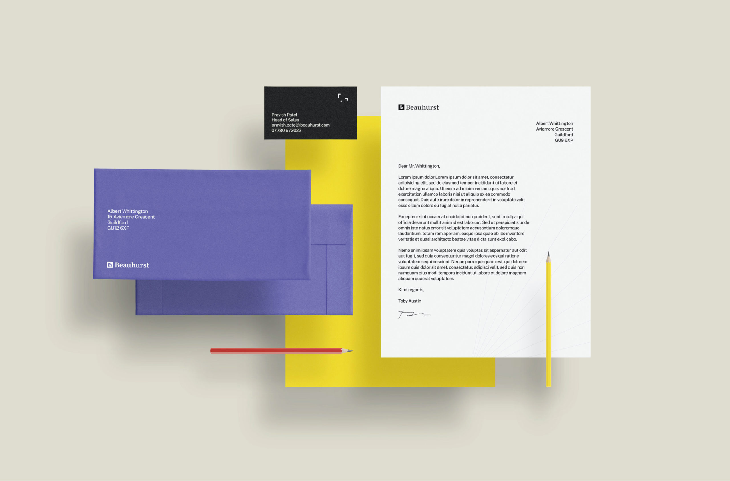
The individual parts of our new logo form our brand building blocks—these can be reconfigured to create different shapes, representing the coming together of parts.
A brand pattern, formed of tesselated brand building blocks, adds texture and visual interest.
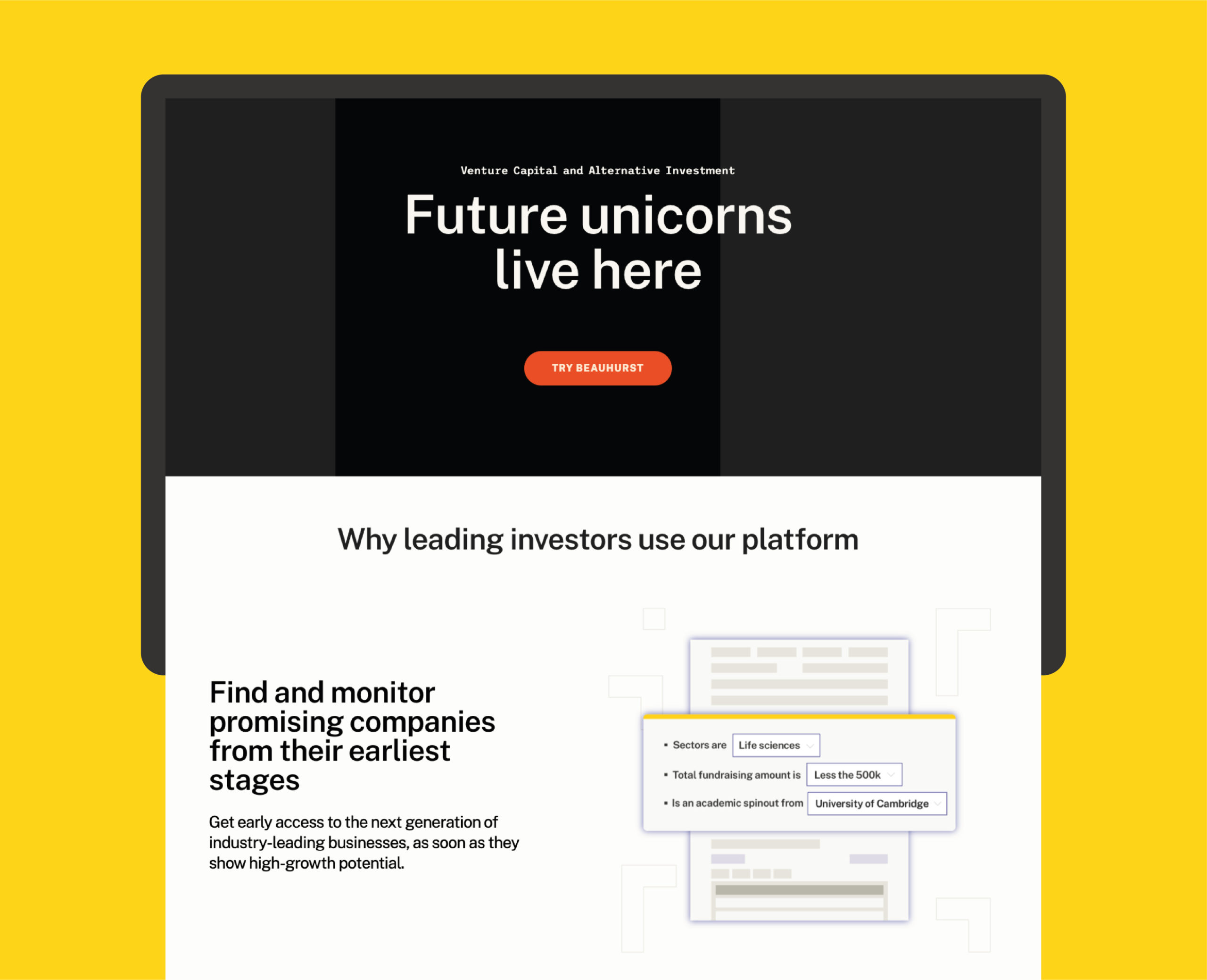
A further visual language is developed through the use of radiating lines as design elements—a nod to the strings of the quipu, adding dynamism and movement.
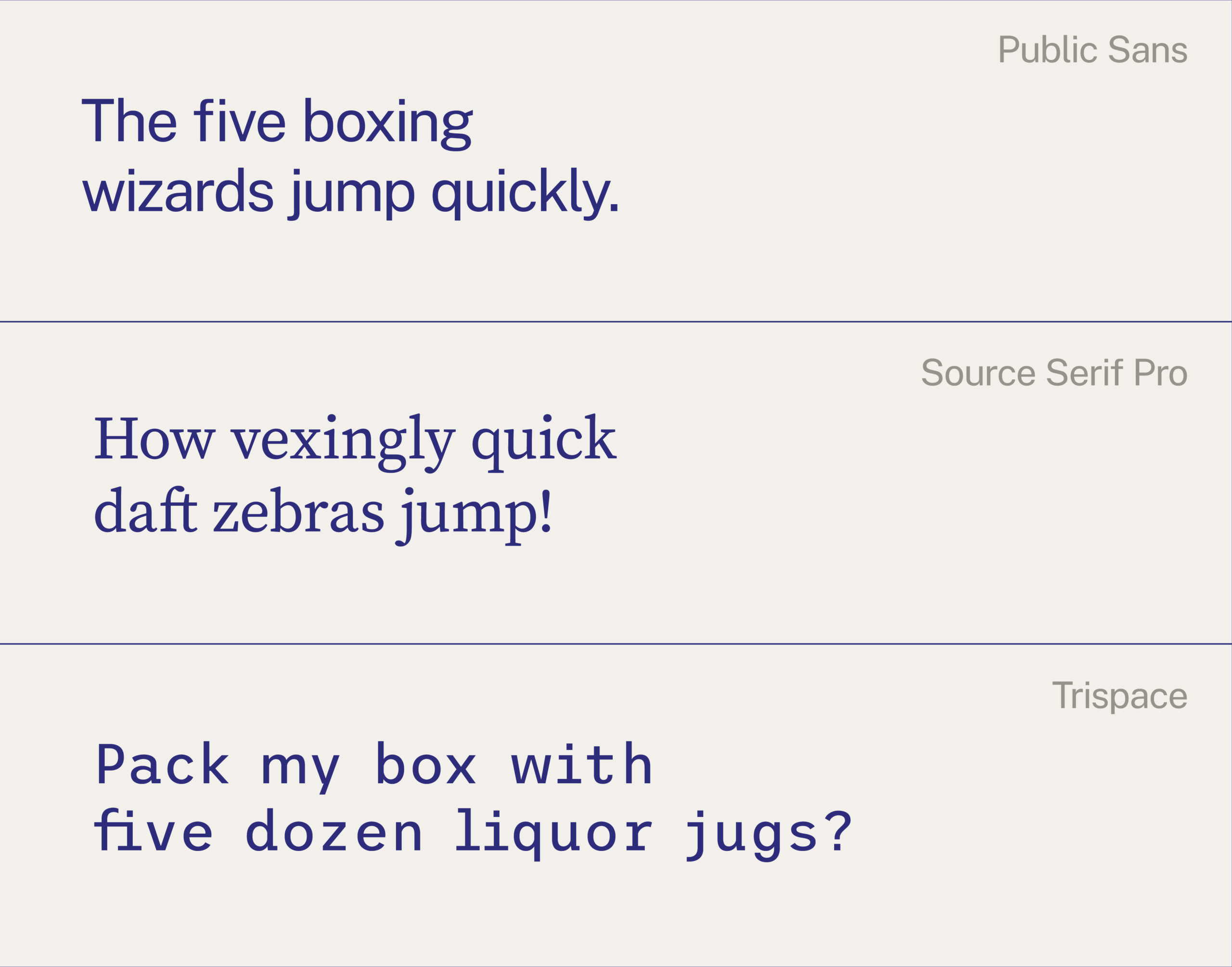
With three typefaces now in our toolkit, our new look is also more versatile, allowing us to move between a more techie or editorial tone for different audiences, and as we continue to grow.
Finally, we’ve introduced a new colour into our primary colour palette, as well as evolving our existing colours to more mature and contemporary hues. Our secondary colour palette adds strong differentiated shades from around the colour wheel—a must for data visualisation.
So there you have it, our new look: the same name, the same product, the same wonderful team, but a brand that’s evolved with us. Nothing will change for our customers, but keep your eyes peeled as we roll out our new visuals over the coming months.
We’re so excited to share everything we’ve been working on behind the scenes with you, with more to come in the next stage of our growth.